Customer Segmentation with K-Means and Tableau
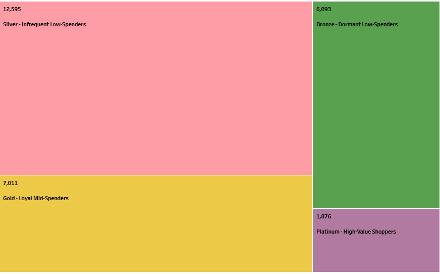
This was a really exciting project where I was able to blend my two academic backgrounds (Marketing and Data Science) to extract insights from an e-commerce clothing store dataset developed by the Google Looker team. The workflow includes data extraction and transformation using Google BigQuery and DBT (Data Build Tool), clustering analysis with Python, and interactive visualization with Tableau.
Data Extraction and Transformation with DBT and Google BigQuery
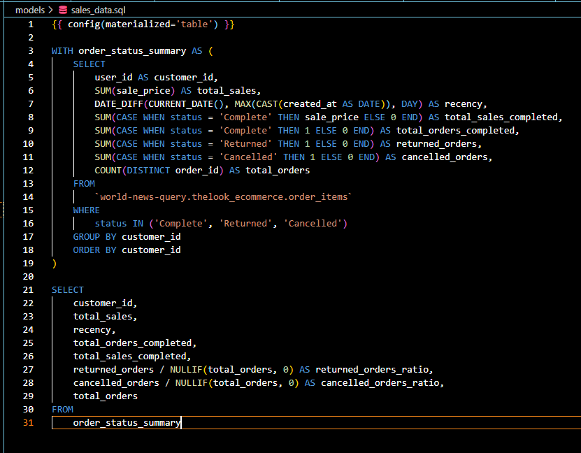
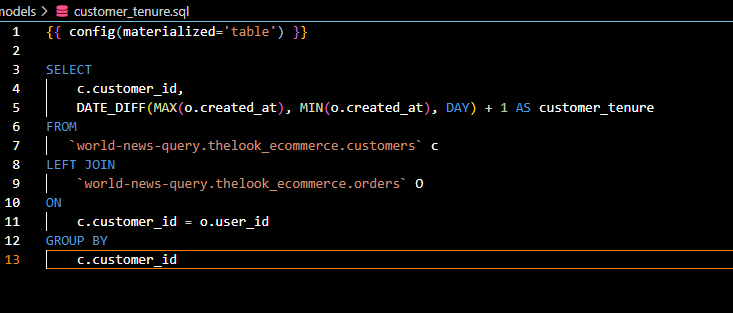
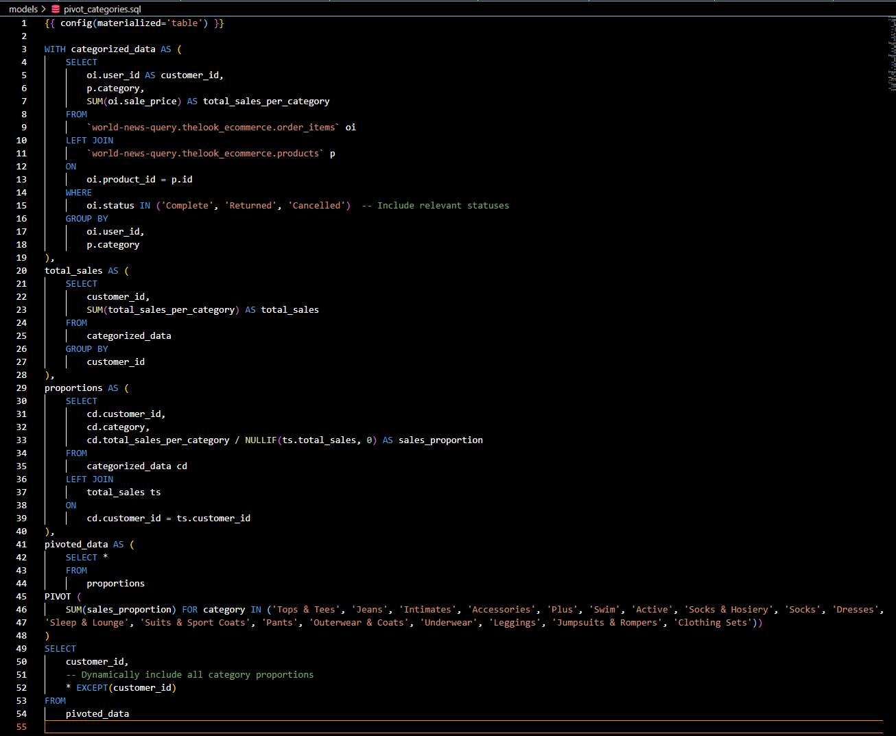
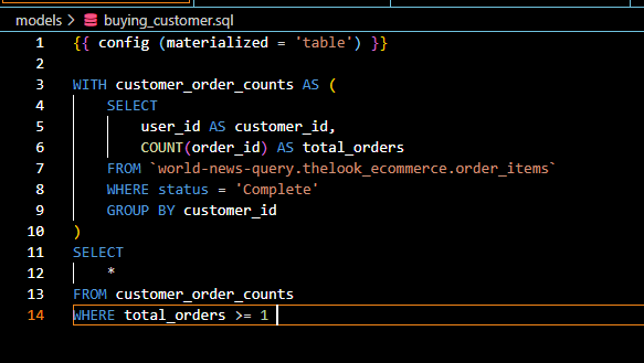
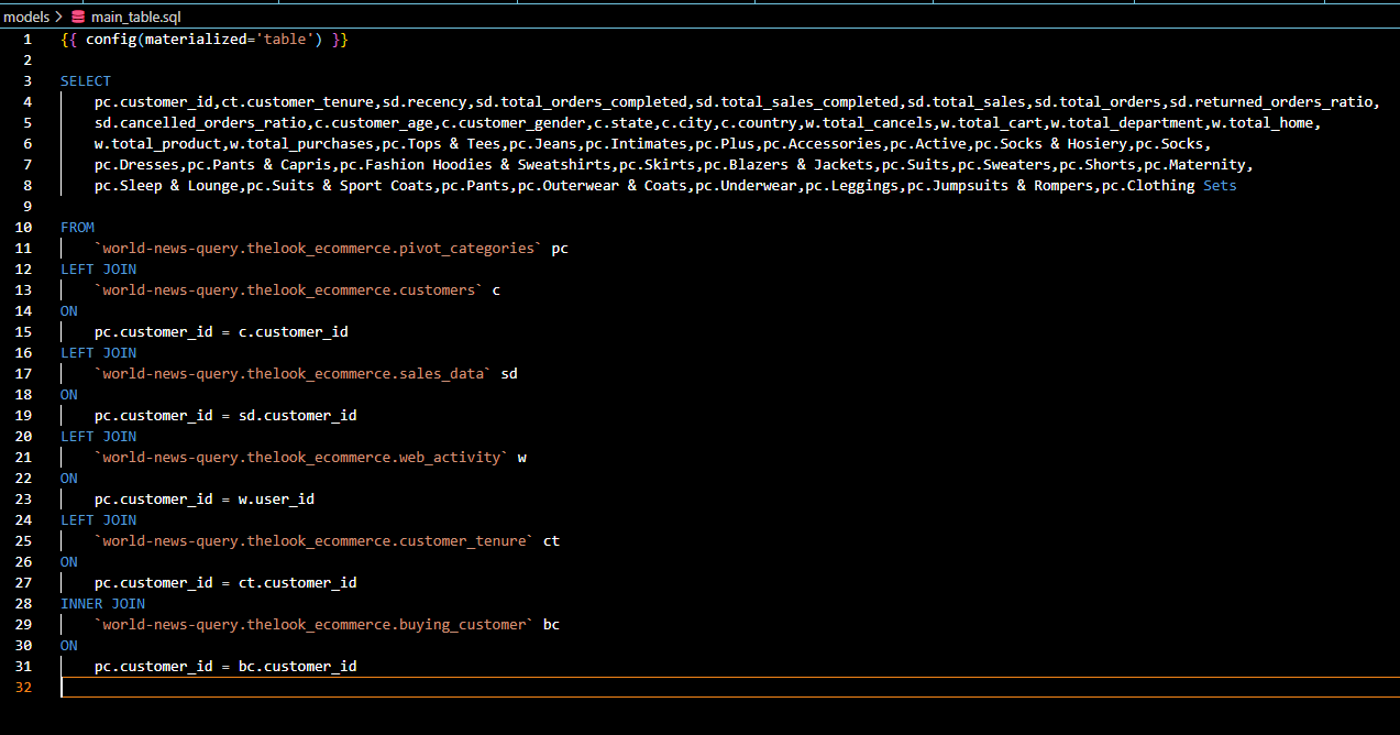
I sourced the raw dataset from the TheLook e-commerce dataset in Google BigQuery, which contains customer behavioral data, including purchase history, order details, product categories and spending metrics. I used DBT to build a robust and reusable data transformation pipeline. Using DBT, I created models to:
- Clean and preprocess the data to ensure consistency and accuracy.
- Transform raw transactional data into aggregated RFM metrics (Recency, Frequency, Monetary) as well as other features like web interactions and category proportions.
Screenshots of the DBT models and pipeline showcase how transformations were designed and executed to prepare the data for clustering analysis.
Clustering Analysis with Python
After extracting and transforming the data, I used Python for exploratory data analysis (EDA) and clustering. Specifically:
- Implemented and explored two different clustering techniques, Gaussian Mixture Model (GMM) and K-Means, to identify distinct customer segments.
- Segmented customers based on RFM metrics, focusing on their purchase behavior and engagement.
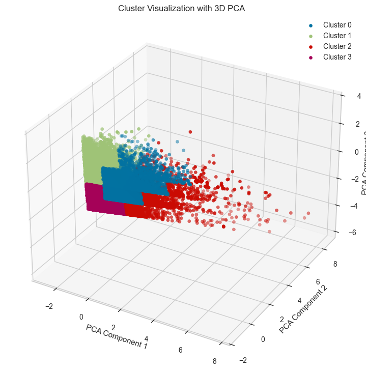
- Evaluated cluster quality using the Silhouette Score, which measures how well-defined the clusters are. K-Means outperformed GMM, achieving a higher Silhouette Score (0.44 vs. 0.33).
- Selected K-Means for final segmentation due to its better performance and more interpretable results.

To visualize how well the K-Means model clustered the data, I used Principal Component Analysis (PCA) to project high-dimensional data into three principal components for visualization:
Interactive Visualization with Tableau
To make the insights actionable, I visualized the clustered data in an interactive Tableau dashboard. The dashboard includes:
- A summary of the customer segments, labeled as Platinum, Gold, Silver, and Bronze.
- Visual comparisons of the clusters based on recency, frequency, and monetary values.
- Geographical insights into customer distribution and segment trends.
- Interactive filters to explore specific timeframes, locations, or customer attributes.
Here is a quick Tier Summary to understand the cusotmer segements a little better.
| Cluster | Classification | Characteristics | Strategy |
|---|---|---|---|
| 2 | Platinum | High spenders, moderately active, low returns | Retain loyalty with VIP benefits, exclusivity |
| 0 | Gold | Mid-level spenders, frequent buyers, high returns | Reduce returns, incentivize repeat purchases |
| 3 | Silver | Low spenders, infrequent buyers, recent activity | Encourage repeat purchases with discounts/offers |
| 1 | Bronze | Dormant, low spenders, very inactive | Reactivate with targeted campaigns or surveys |
Below you will find the interactive Tableau dashboard:
This visualization enables stakeholders to quickly identify high-value customers, dormant users, and actionable marketing opportunities.
Conclusion
By combining DBT for data transformation, Python for clustering analysis, and Tableau for visualization, this project delivers a comprehensive solution for customer segmentation. Next steps include a model to predict customer lifetime value, building a data pipeline and automating the workflow. Thanks for reading!